---
title: "Bootstrap simulation for model prediction"
author: "Ewen Harrison"
output: rmarkdown::html_vignette
vignette: >
%\VignetteIndexEntry{Bootstrap simulation for model prediction}
%\VignetteEngine{knitr::rmarkdown}
%\VignetteEncoding{UTF-8}
---
```{r setup, include = FALSE}
knitr::opts_chunk$set(
collapse = TRUE,
comment = "#>"
)
```
I’ve always been a fan of converting model outputs to real-life quantities of interest. For example, I like to supplement a logistic regression model table with predicted probabilities for a given set of explanatory variable levels. This can be more intuitive than odds ratios, particularly for a lay audience.
For example, say I have run a logistic regression model for predicted 5 year survival after colon cancer. What is the actual probability of death for a patient under 40 with a small cancer that has not perforated? How does that probability differ for a patient over 40?
I’ve tried this various ways. I used [Zelig](https://zeligproject.org/) for a while including [here](https://www.bmj.com/content/344/bmj.e3330), but it started trying to do too much and was always broken (I updated it the other day in the hope that things were better, but was met with a string of errors again).
I also used [rms](https://CRAN.R-project.org/package=rms), including [here](https://journals.plos.org/plosone/article?id=10.1371/journal.pone.0148782) (checkout the nice plots!). I like it and respect the package. But I don’t use it as standard and so need to convert all the models first, e.g. to lrm. Again, for my needs it tries to do too much and I find datadist awkward.
Thirdly, I love [Stan](https://mc-stan.org/users/interfaces/rstan) for this, e.g. used in this [paper](https://doi.org/10.1016/S1473-3099(18)30101-4). The generated quantities block allows great flexibility to simulate whatever you wish from the posterior. I’m a Bayesian at heart will always come back to this. But for some applications it’s a bit much, and takes some time to get running as I want.
I often simply want to predict y-hat from lm and glm with bootstrapped intervals and ideally a comparison of explanatory levels sets. Just like `sim` does in `Zelig`. But I want it in a format I can immediately use in a publication.
Well now I can with `finalfit`
There’s two main functions with some new internals to help expand to other models in the future.
Make sure you are on the most up-to-date version of finalfit.
```{r, eval=FALSE}
install.packages("finalfit")
```
## Create new dataframe of explanatory variable levels
`ff_newdata` (alias: `finalfit_newdata`) is used to generate a new dataframe. See the next section for an alternative approach to doing this. I usually want to set 4 or 5 combinations of `x` levels and often find it difficult to get this formatted correctly to use with `predict`. Pass the original dataset, the names of explanatory variables used in the model, and a list of levels for these. For the latter, they can be included as rows or columns. If the data type is incorrect or you try to pass factor levels that don’t exist, it will fail with a useful warning.
```{r}
library(finalfit)
explanatory = c("age.factor", "extent.factor", "perfor.factor")
dependent = 'mort_5yr'
colon_s %>%
finalfit_newdata(explanatory = explanatory, newdata = list(
c("<40 years", "Submucosa", "No"),
c("<40 years", "Submucosa", "Yes"),
c("<40 years", "Adjacent structures", "No"),
c("<40 years", "Adjacent structures", "Yes") )) -> newdata
newdata
```
## `ff_expand()` for creating new data frame
`ff_expand()` has been added to aid in setting up new data frames for model prediction. It uses two further functions (`ff_mode()` and `summary_df()`) to generate a data frame which includes the mode of factors (most frequent occurrence of a factor level) and the mean or median of numeric variables, together with an expansion of specified factors to include all combinations of their levels.
This is commonly needed when simulating model predictions.
```{r}
library(dplyr)
colon_s %>%
select(-hospital) %>%
ff_expand(age.factor, sex.factor)
```
## Run bootstrap simulations of model predictions
`boot_predict` takes standard `lm` and `glm` model objects, together with `finalfit` `lmlist` and `glmlist` objects from fitters, e.g. `lmmulti` and `glmmulti`. In addition, it requires a `newdata` object generated from `ff_newdata`. If you’re new to this, don’t be put off by all those model acronyms, it is straightforward.
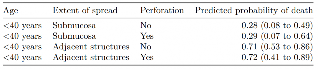
```{r}
colon_s %>%
glmmulti(dependent, explanatory) %>%
boot_predict(newdata,
estimate_name = "Predicted probability of death",
R=100, boot_compare = FALSE,
digits = c(2,3))
```
Note that the number of simulations (`R`) here is low for demonstration purposes. You should expect to use 1000 to 10000 to ensure you have stable estimates.
## Output to Word, PDF, and html via RMarkdown
Simulations are produced using bootstrapping and everything is tidily outputted in a table/dataframe, which can be passed to `knitr::kable`.
Place this chunk in an .Rmd file:
```{r, eval=FALSE}
knitr::kable(table, row.names = FALSE, align = c("l", "l", "l", "r"))
```
 ## Make comparisons
Better still, by including `boot_compare=TRUE` (default), comparisons are made between the first row of newdata and each subsequent row. These can be first differences (e.g. absolute risk differences) or ratios (e.g. relative risk ratios). The comparisons are done on the individual bootstrap predictions and the distribution summarised as a mean with percentile confidence intervals (95% CI as default, e.g. 2.5 and 97.5 percentiles). A p-value is generated on the proportion of values on the other side of the null from the mean, e.g. for a ratio greater than 1.0, p is the number of bootstrapped predictions under 1.0. Multiplied by two so it is two-sided.
```{r}
colon_s %>%
glmmulti(dependent, explanatory) %>%
boot_predict(newdata,
estimate_name = "Predicted probability of death",
#compare_name = "Absolute risk difference",
R=100, digits = c(2,3))
```
## What is not included?
It doesn’t yet include our other common models, such as `coxph` which I may add in. It doesn’t do `lmer` or `glmer` either. `bootMer` works well mixed-effects models which take a bit more care and thought, e.g. how are random effects to be handled in the simulations. So I don’t have immediate plans to add that in, better to do directly.
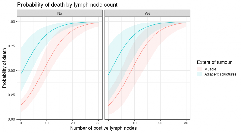
## Plotting
Finally, as with all finalfit functions, results can be produced as individual variables using `condense == FALSE`. This is particularly useful for plotting.
```{r, eval=FALSE}
library(finalfit)
library(ggplot2)
theme_set(theme_bw())
explanatory = c("nodes", "extent.factor", "perfor.factor")
dependent = 'mort_5yr'
colon_s %>%
finalfit_newdata(explanatory = explanatory, rowwise = FALSE,
newdata = list(
rep(seq(0, 30), 4),
c(rep("Muscle", 62), rep("Adjacent structures", 62)),
c(rep("No", 31), rep("Yes", 31), rep("No", 31), rep("Yes", 31))
)
) -> newdata
colon_s %>%
glmmulti(dependent, explanatory) %>%
boot_predict(newdata, boot_compare = FALSE,
R=100, condense=FALSE) %>%
ggplot(aes(x = nodes, y = estimate, ymin = estimate_conf.low,
ymax = estimate_conf.high, fill=extent.factor))+
geom_line(aes(colour = extent.factor))+
geom_ribbon(alpha=0.1)+
facet_grid(.~perfor.factor)+
xlab("Number of postive lymph nodes")+
ylab("Probability of death")+
labs(fill = "Extent of tumour", colour = "Extent of tumour")+
ggtitle("Probability of death by lymph node count")
```
## Make comparisons
Better still, by including `boot_compare=TRUE` (default), comparisons are made between the first row of newdata and each subsequent row. These can be first differences (e.g. absolute risk differences) or ratios (e.g. relative risk ratios). The comparisons are done on the individual bootstrap predictions and the distribution summarised as a mean with percentile confidence intervals (95% CI as default, e.g. 2.5 and 97.5 percentiles). A p-value is generated on the proportion of values on the other side of the null from the mean, e.g. for a ratio greater than 1.0, p is the number of bootstrapped predictions under 1.0. Multiplied by two so it is two-sided.
```{r}
colon_s %>%
glmmulti(dependent, explanatory) %>%
boot_predict(newdata,
estimate_name = "Predicted probability of death",
#compare_name = "Absolute risk difference",
R=100, digits = c(2,3))
```
## What is not included?
It doesn’t yet include our other common models, such as `coxph` which I may add in. It doesn’t do `lmer` or `glmer` either. `bootMer` works well mixed-effects models which take a bit more care and thought, e.g. how are random effects to be handled in the simulations. So I don’t have immediate plans to add that in, better to do directly.
## Plotting
Finally, as with all finalfit functions, results can be produced as individual variables using `condense == FALSE`. This is particularly useful for plotting.
```{r, eval=FALSE}
library(finalfit)
library(ggplot2)
theme_set(theme_bw())
explanatory = c("nodes", "extent.factor", "perfor.factor")
dependent = 'mort_5yr'
colon_s %>%
finalfit_newdata(explanatory = explanatory, rowwise = FALSE,
newdata = list(
rep(seq(0, 30), 4),
c(rep("Muscle", 62), rep("Adjacent structures", 62)),
c(rep("No", 31), rep("Yes", 31), rep("No", 31), rep("Yes", 31))
)
) -> newdata
colon_s %>%
glmmulti(dependent, explanatory) %>%
boot_predict(newdata, boot_compare = FALSE,
R=100, condense=FALSE) %>%
ggplot(aes(x = nodes, y = estimate, ymin = estimate_conf.low,
ymax = estimate_conf.high, fill=extent.factor))+
geom_line(aes(colour = extent.factor))+
geom_ribbon(alpha=0.1)+
facet_grid(.~perfor.factor)+
xlab("Number of postive lymph nodes")+
ylab("Probability of death")+
labs(fill = "Extent of tumour", colour = "Extent of tumour")+
ggtitle("Probability of death by lymph node count")
```
 So there you have it. Straightforward bootstrapped simulations of model predictions, together with comparisons and easy plotting.